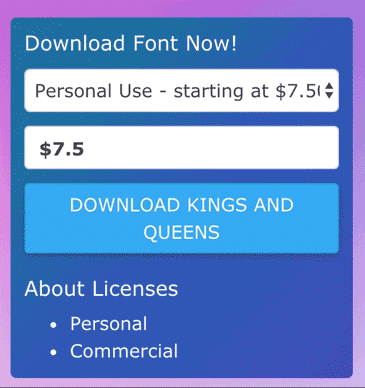
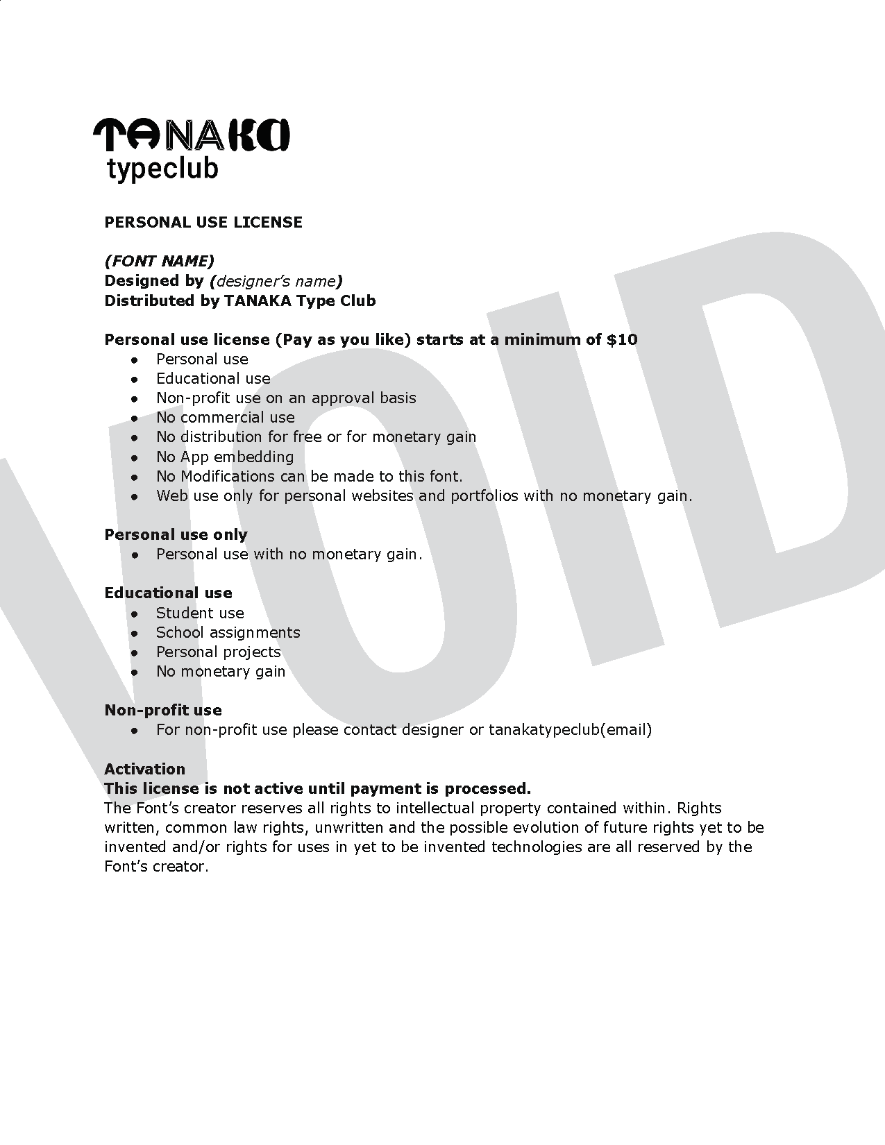
Tanaka Type Club

A not-for-profit font foundry site with typefaces for download.
PROBLEM
  • We discovered that independent designers and design students don’t have access to sell their typefaces on font foundries.
  • The other issue is that there are no decentralized payment e-commerce platforms for building a digital distribution shop. In other words, there is no way for a shop owner to not have to handle money from sales.
SOLUTION
Tanaka Type Club is a not for profit type distribution site for independent designers. We built this site as a data driven React web app. Because the primary shop owner did not want to handle the money, we used PayPal as a way to decentralize the payments and send the money directly to the designers.
FULL CASE STUDY
A Design Collaboration With
Bonita Tanaka: Professor and Designer
Dan Grayson: Software Engineer
Explore The Live Site
TANAKA Type Club
My Role
UX Research
Branding
Web Design
Product Management

Understanding What Designers Need

My research included ongoing correspondence with designers, which helped me make sure the site was aligned with their needs.
Key Takeaways
  • Provide a simple typeface commerce system.
  • Link to designers' LinkedIn, personal sites, and places where they sell their work.
  • Show the designers and promote their stories.
Pain Points
  • A way to sell their typefaces.
  • New ways to promote their personal brands.
  • A space to make connections for networking.

Site Ideation

SKETCHING
Bonita and I started our ideation with sketching. We explored branding, logo design, and site layouts. Sketching is very important to my process in collaboration, this is because it facilitates exploration and defines a common ground.
WIREFRAMES
I designed the wireframes in sketch. These wireframes gave us the ability to map out the site's content. I made sure to design for different platforms to create consistency.
HIGH FIDELITY
The higher fidelity prototypes were designed in Sketch. These were used to give our software engineer a reference for coding the front-end of the site, and for early user testing.
Site Updates
I used Material Design as a reference when working on updating the font cards. This update included adding the designer's icons and names to the font cards.

Visual Design / Branding

LOGO IDEATION
The goal with the logo design was to highlight the diversity of the site's typefaces, while keeping the brand's unique identity.
GRADIENTS
We explored different themes around movement, with subtle shifting gradients. The challenge we faced was making sure the background would not be distracting.
ANIMATED LOGO
The changing and animated logo gives the viewer a sense of the different unique typefaces that are sold on the site.
MICRO-INTERACTIONS
Micro-Interactions were used in subtle ways to create interest and charm. This can be seen here on the download box, with subtle shifting of the background gradient and button styles.

Content Creation

Designer Licenses
It was very important that the designers' work was protected. These licenses were created by myself and Bonita, by researching legal documentation. We created:

  • Commercial Licenses
  • Personal Licenses
  • Pricing based on designers' requests and research on standard pricing.

I created both the commercial and personal licenses for each designer’s typeface. My hope for the future is to automate the PDF generation of the licenses.

Technical Requirements

Data-driven Needs
We had a very limited budget, and because of this constraint, I had to recruit a software engineer to donate time to help build the site.

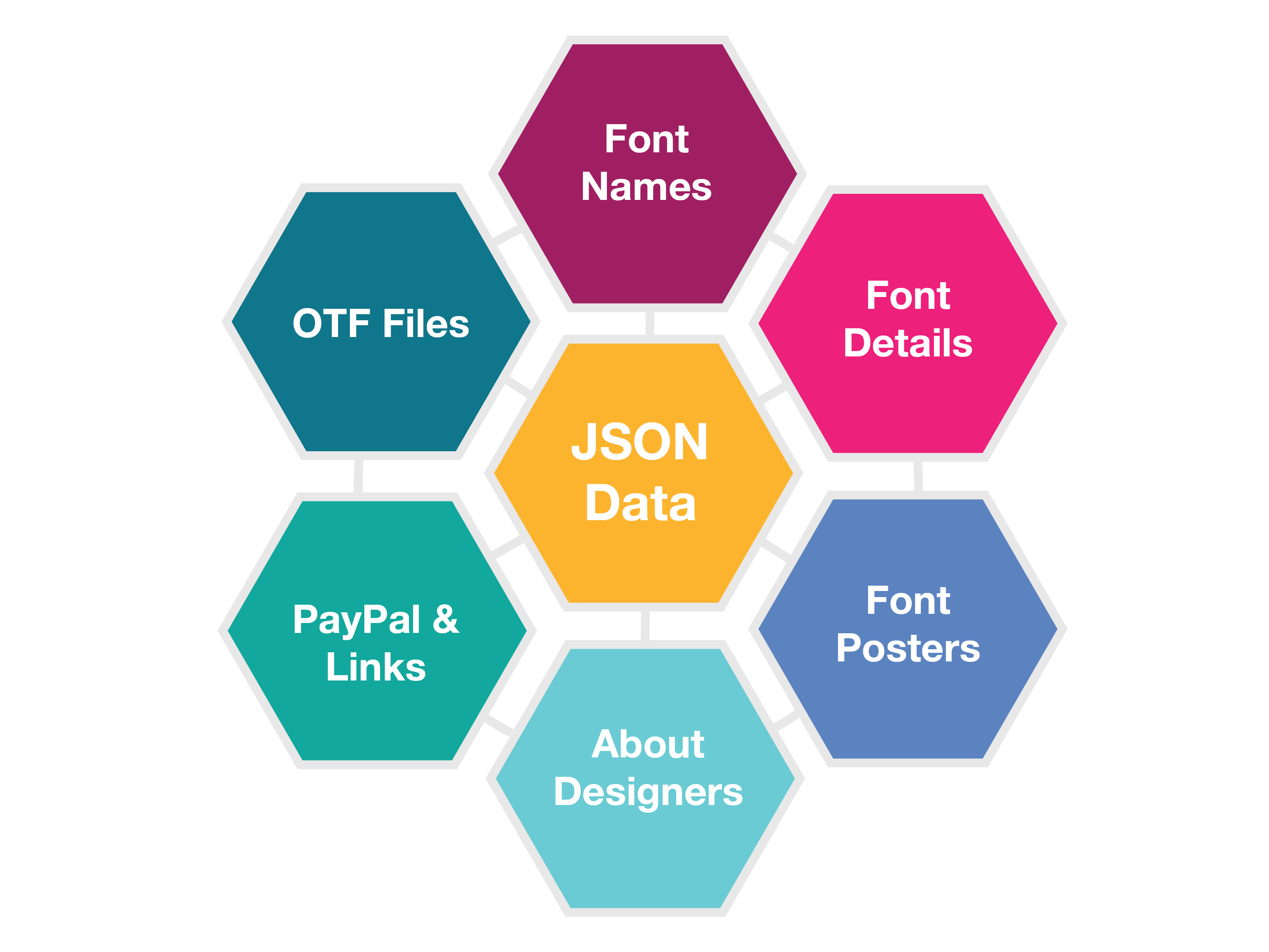
During the early technical meetings with our engineer, it became clear from the type of content we wanted to display, that the site needed to be data-driven rather than static content.

This was because much of the site content was similar types of things (fonts, people, font download forms, etc) but with different details.

By making the site data-driven, the code could be minimal and reusable, and the site could be easily edited and updated in the future by only touching a data file rather than the more complicated parts of code.

I was responsible for collecting, organizing, and optimizing the site content. I collaborated through GitHub, and managed the JSON data files that underly the site's content.

Decentralized Payments

Because Bonita did not want to act as a centralized collector and distributor of payments, we needed to figure out a way to enable direct payments to designers from the purchasers of the typefaces. I researched decentralized payment options and was able to design an experience via PayPal that worked within these constraints.

This solution also keeps Tanaka Type Club easier to maintain because it does not need to have any e-commerce infrastructure.
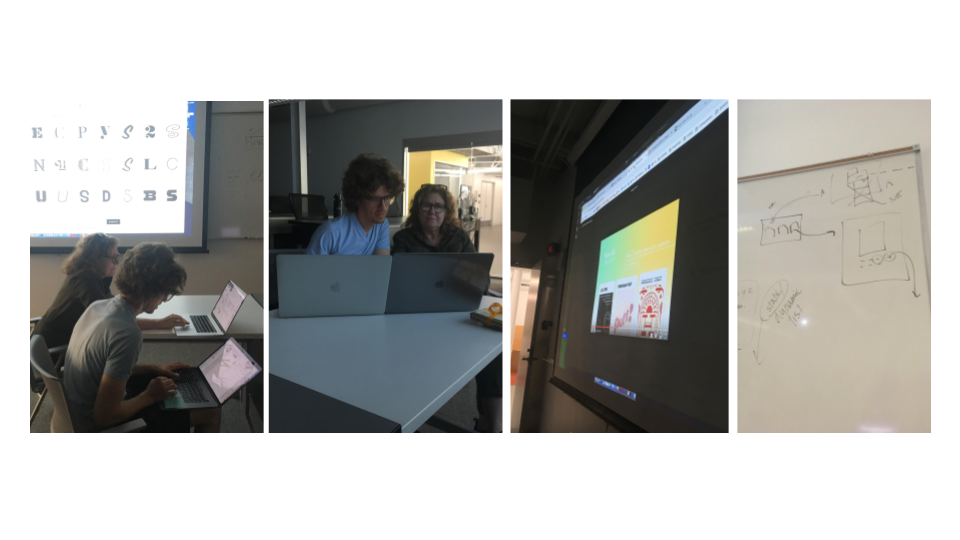
User Testing

Getting feedback
Our first round of testing was a user test with a typography designer and an industry professional.

Navigation Takeaways
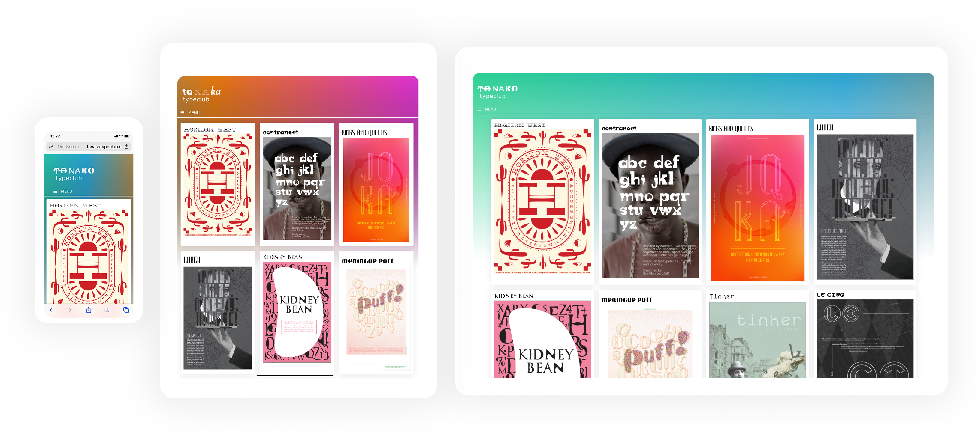
Initial feedback was to change the top navigation from displaying across the top of the page, and instead have a side navigation with a dropdown menu.

Content Takeaways
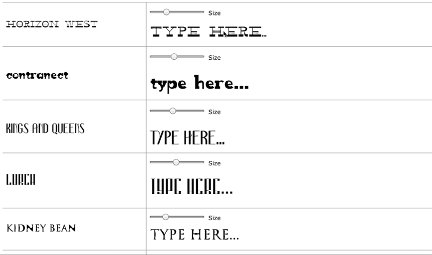
A pain point we discovered was that designers dislike having to retype their test content when discovering fonts on online distribution sites.
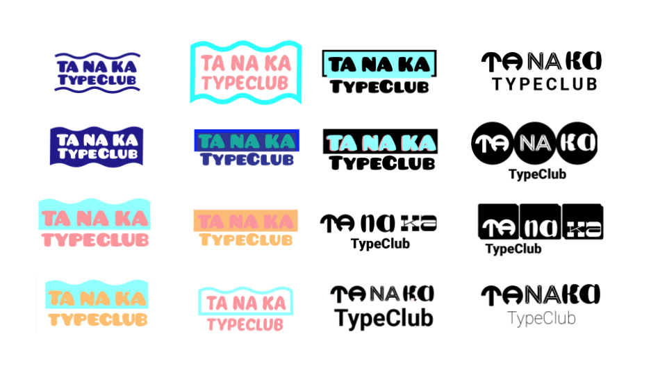
  • Our Solution: when test-driving the typeface, the text that the user inputs applies to all of the typefaces on the page, and is remembered on all the other pages.

Visual Takeaways

  • Animations must shift very slowly so that they are not distracting.
  • Any color shifting with backgrounds must be very subtle or change when you click on a new page.